The paw is a must.
The paw is a must.
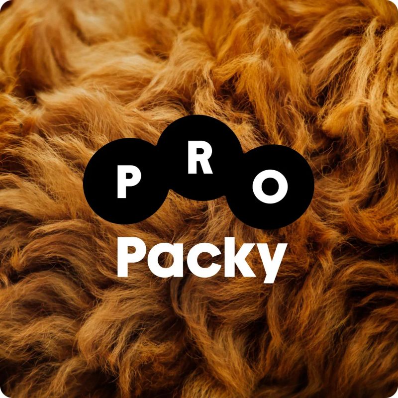
The brand ProPacky (For Paws) offers high-quality pet food and other products for pets. Its original visual identity, however, felt more at home in the budget pet food aisle. Our task was to move the brand upmarket while keeping it approachable and affordable enough to appeal to a broad range of customers.
The challenge
There was one non-negotiable requirement in the rebrand: the paw had to stay. No discussion. No way around it. For us, that was a fairly strict limitation, but it was clear from day one, and that's fair. The challenge was therefore to find a simple visual principle that could retain the paw without feeling childish, cheap or painfully obvious.

The solution
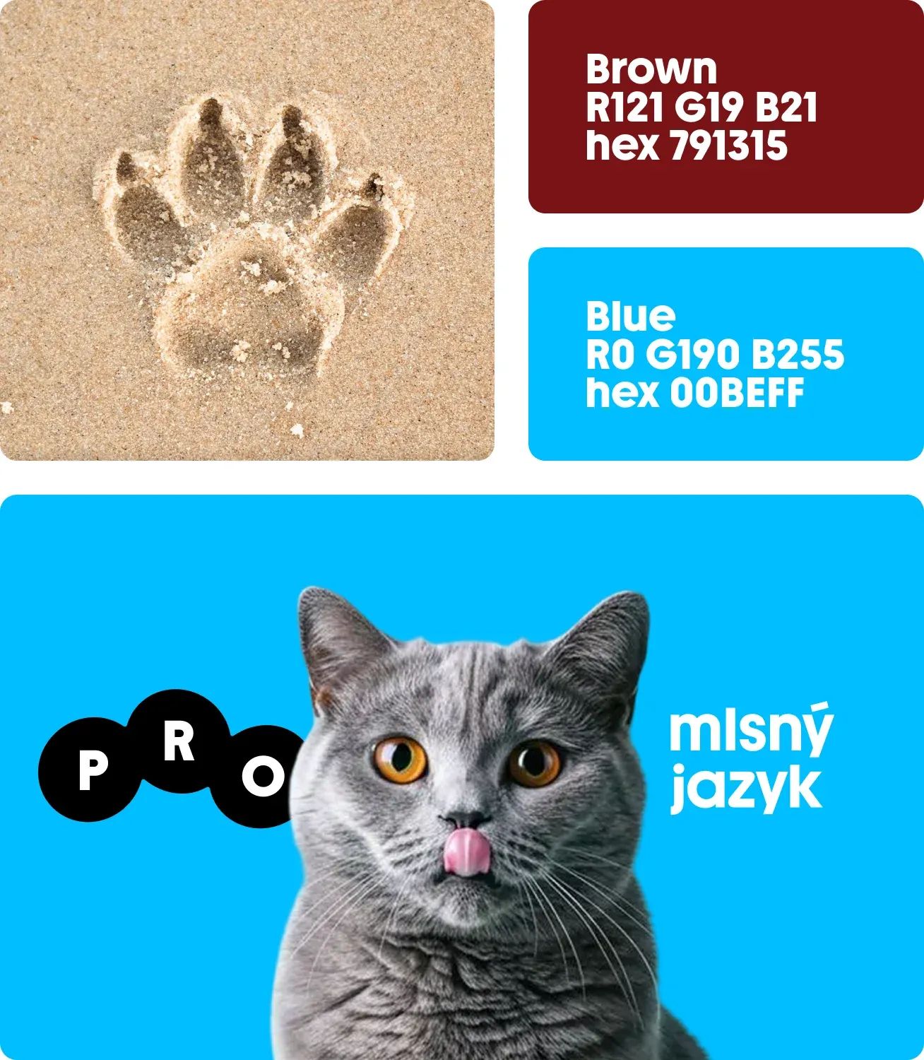
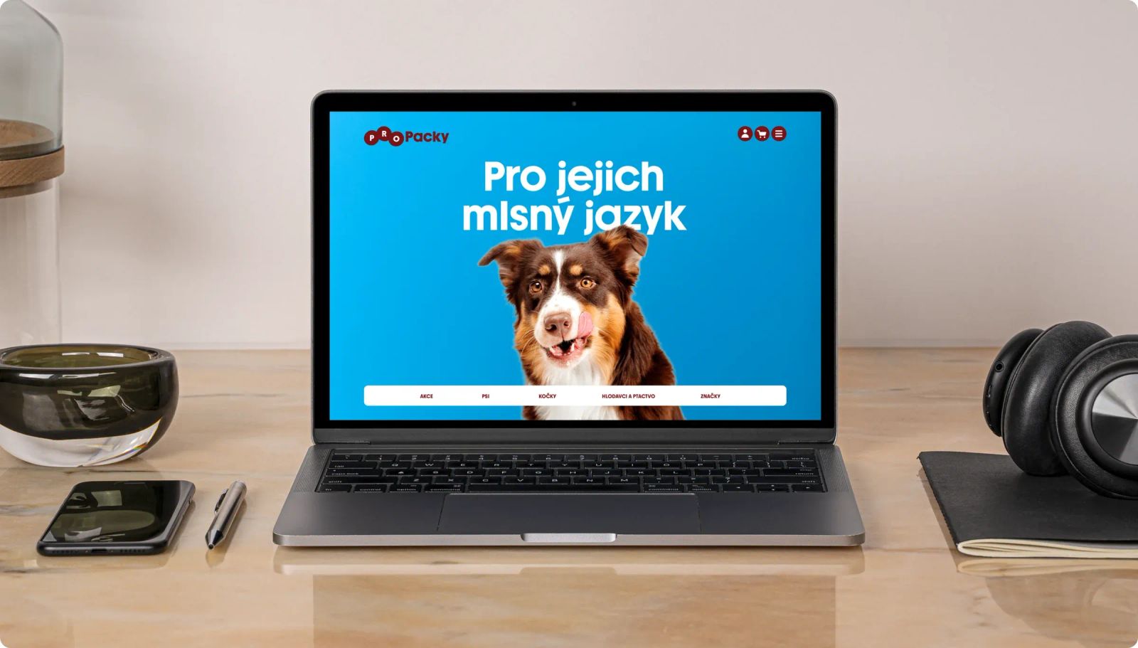
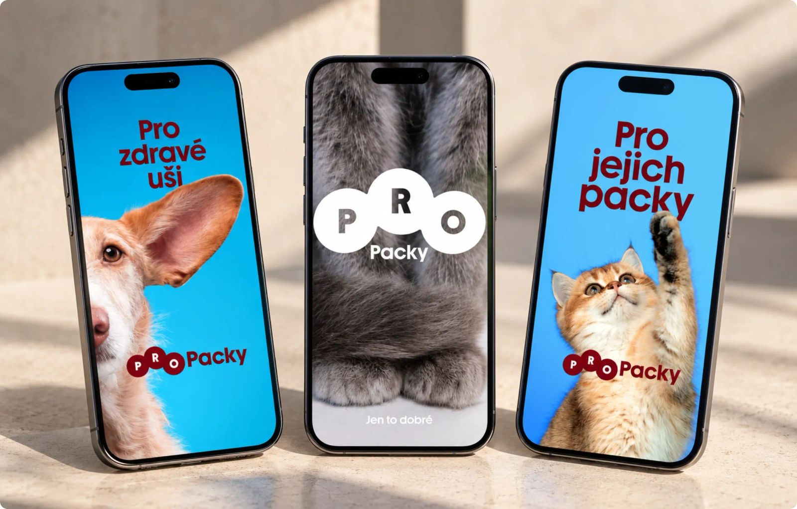
We created a symbol inspired by both a stylised animal paw and the shape of a piece of dry pet food. For the colour palette, we prioritised impact and instant recognition, deliberately choosing an unexpected combination of primary colours that wasn't already owned by competitors in the category.
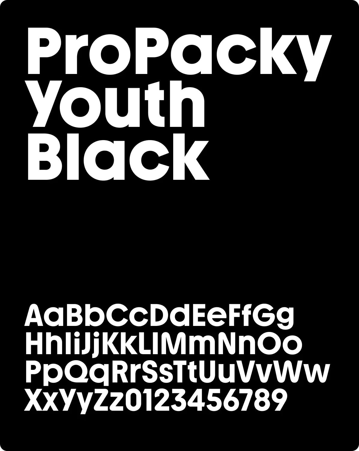
To keep the brand on the right side of accessible, we chose the sans-serif typeface Youth Black. Elegant, contemporary and timeless, it sits right on the line between premium and approachable.
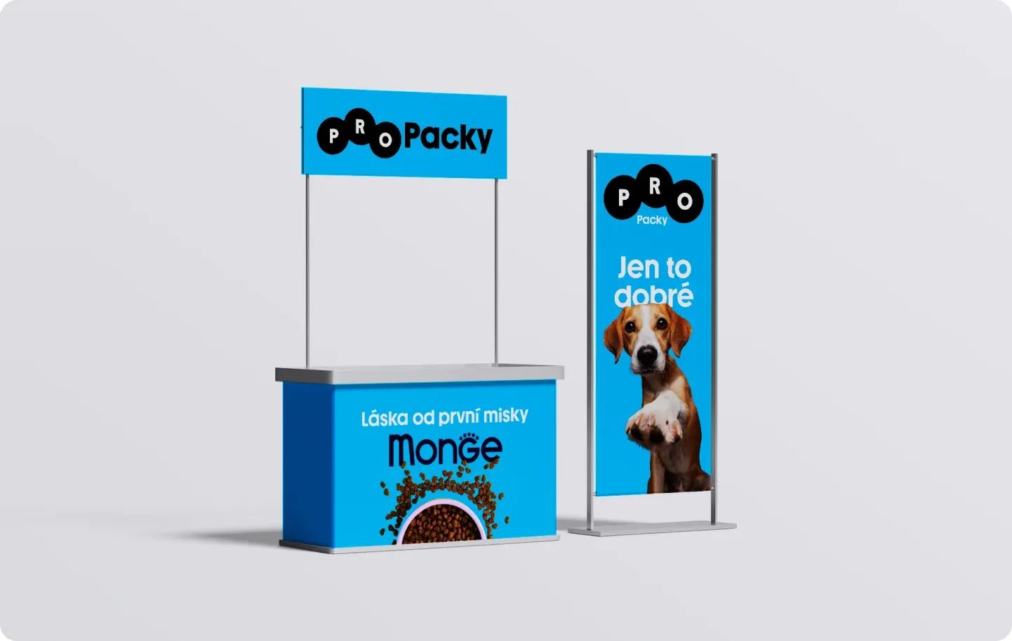
As a little bonus, the final delivery also included the claim “Only the good stuff”. It reinforces the same positioning: moving the brand upmarket without losing its warmth or civil tone of voice.
The result
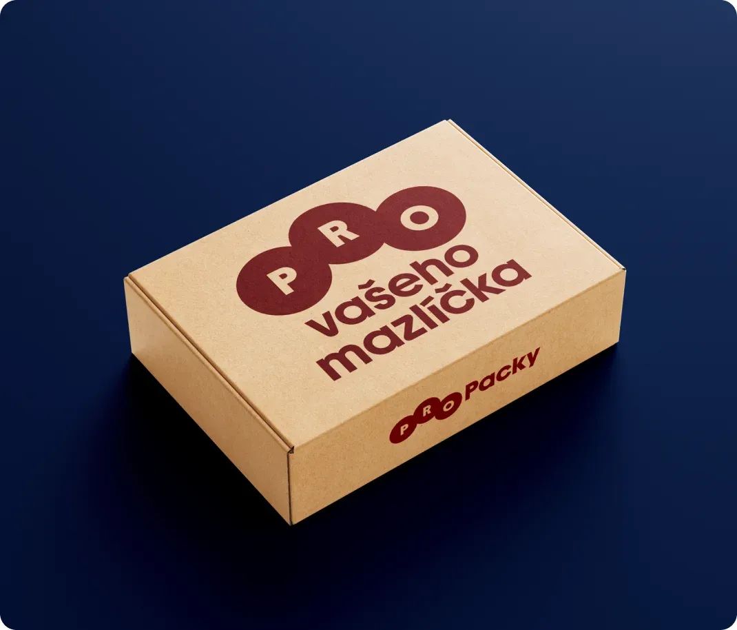
The new visual identity feels modern and premium without becoming too exclusive. It's simple enough for everyday communication, yet leaves plenty of room to be playful, both visually and in copywriting.
More projects
you might like