Where shopping puts a smile on your face
Where shopping puts a smile on your face
MY Park is a retail park brand within the portfolio of real estate and development company Reticulum. Its properties share a simple philosophy: convenient locations, easy parking and shopping, and happy tenants as well as happy customers.
The challenge
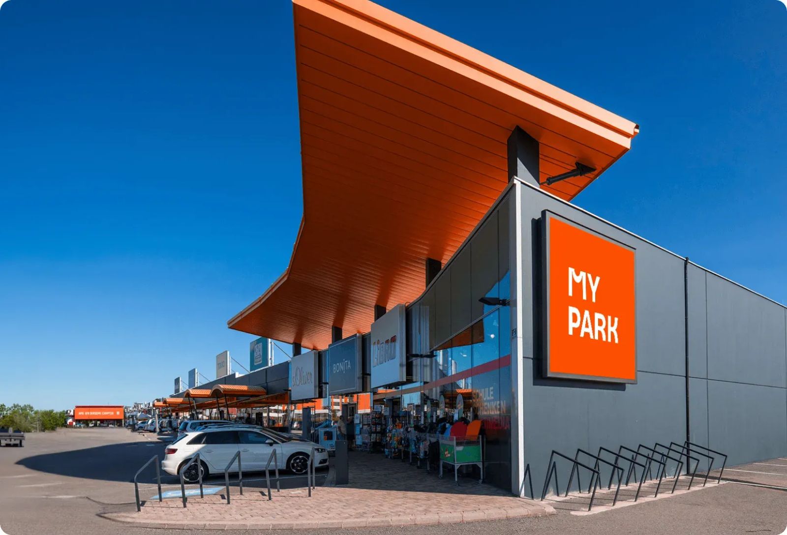
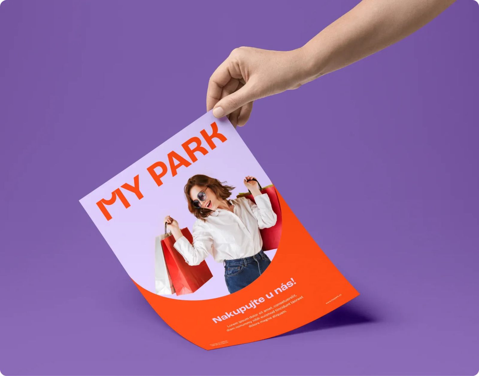
Our task was to create a new visual identity for MY Park that could work consistently across its entire network of retail parks, from large outdoor pylons and wayfinding to leaflets, social media and everyday communication. We needed a simple, instantly recognisable visual idea that could bring different locations in several countries together under one brand.
The solution
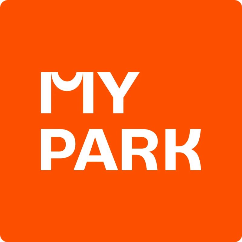
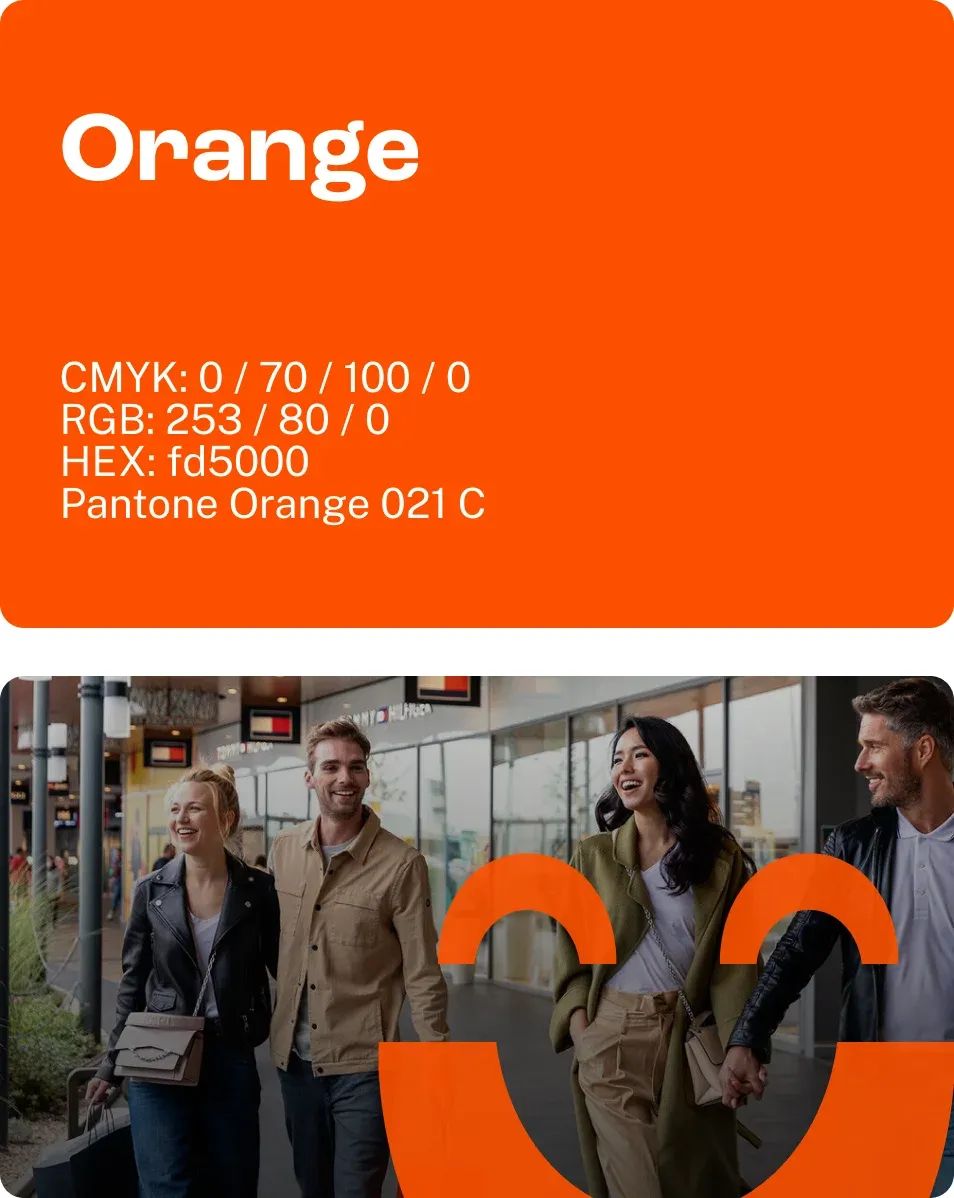
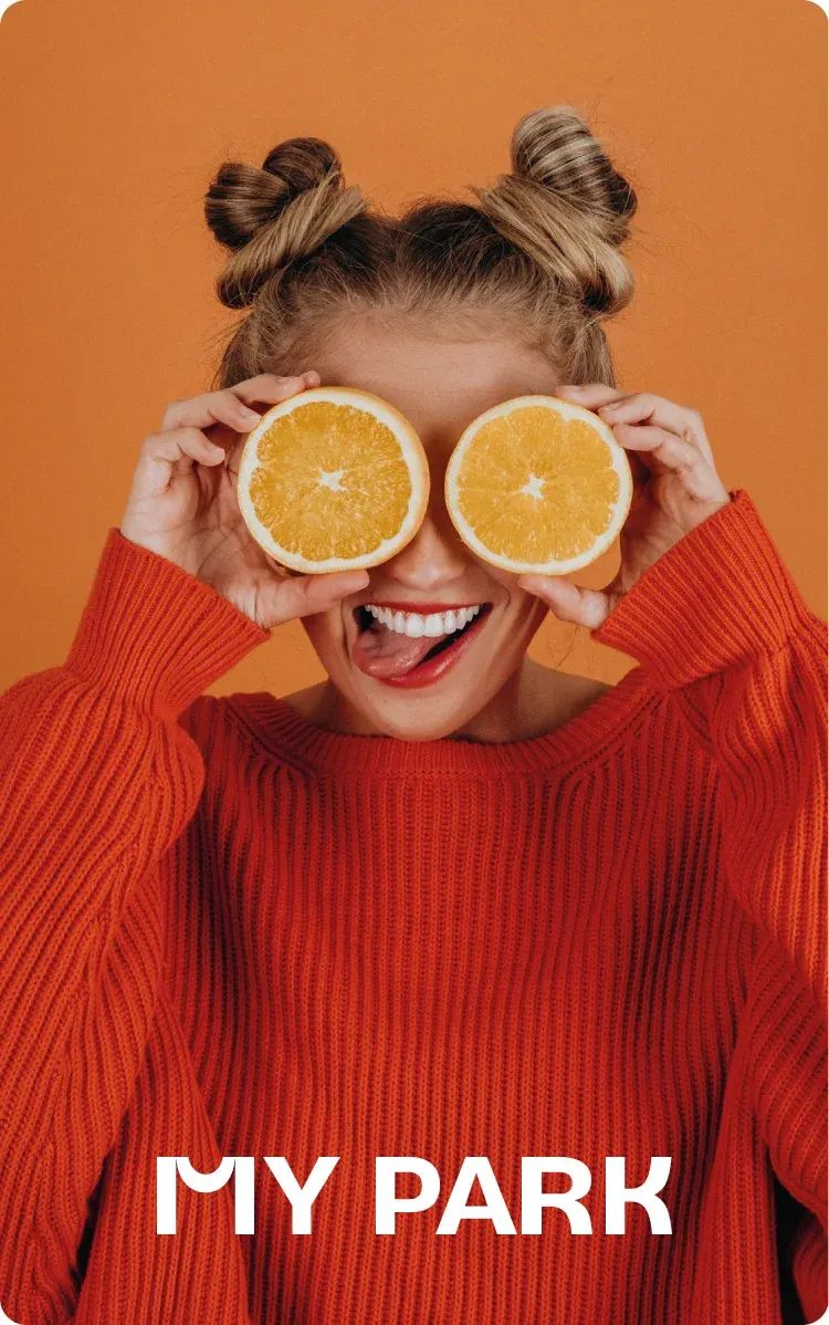
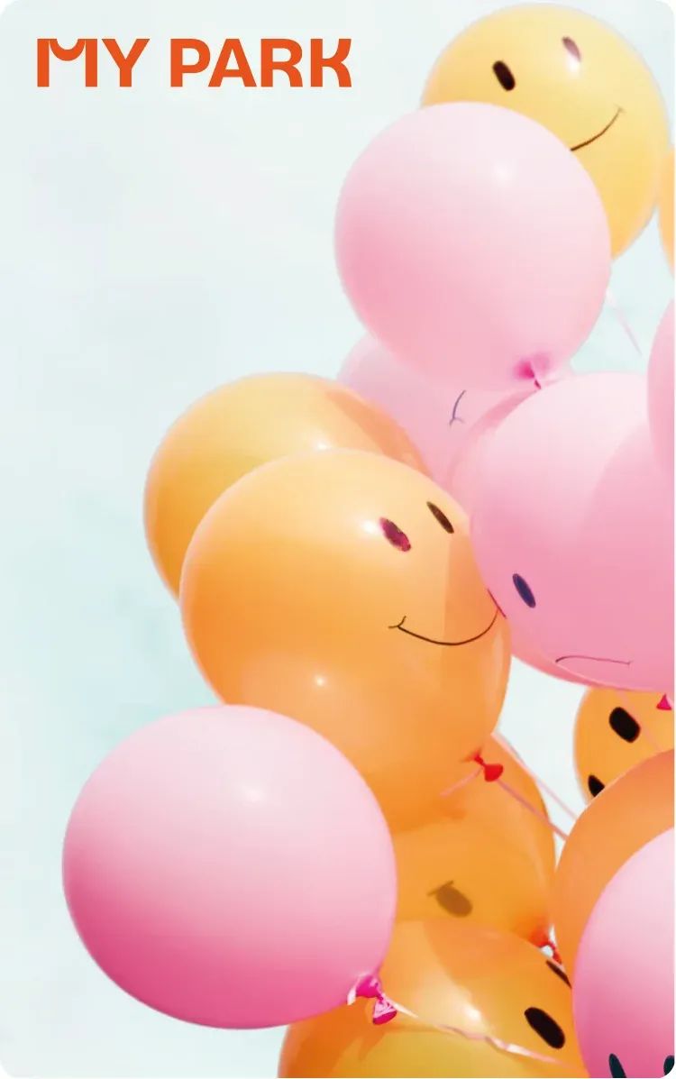
We distilled a long list of rational benefits into one simple emotion: the satisfaction of a good shopping experience. We redrew the letter M so that it resembles a smile while simultaneously revealing a shopping bag in its negative space.
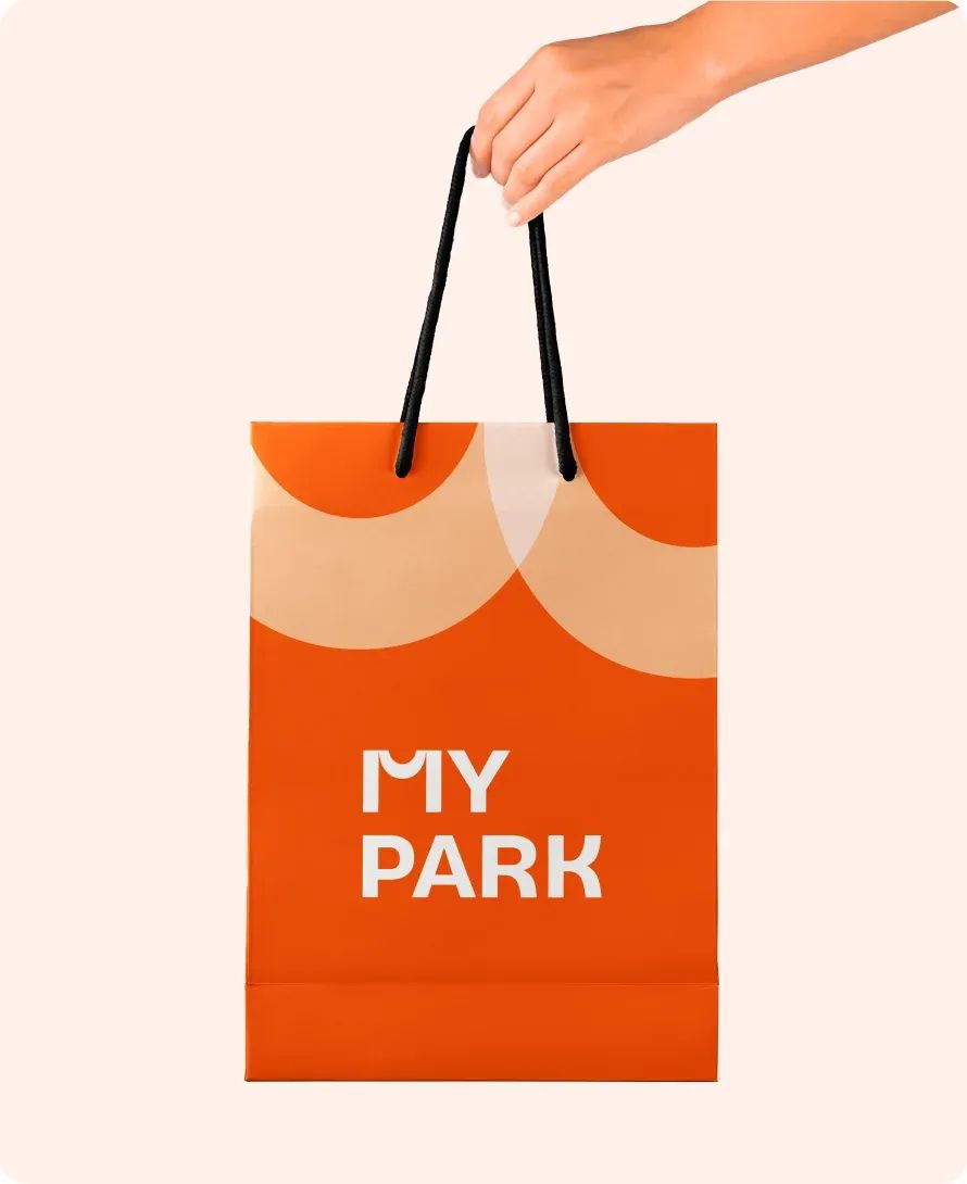
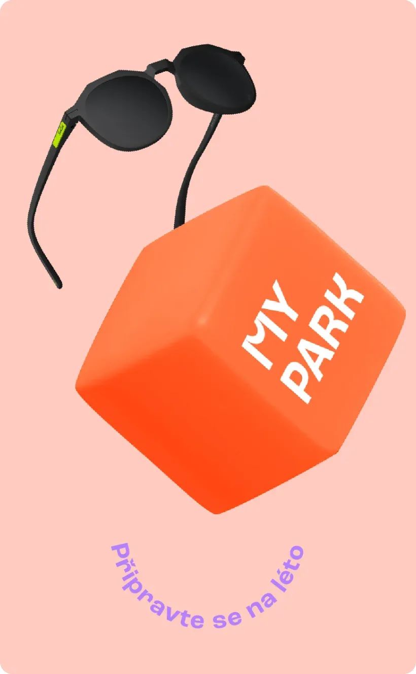
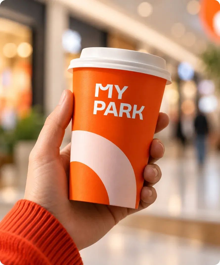
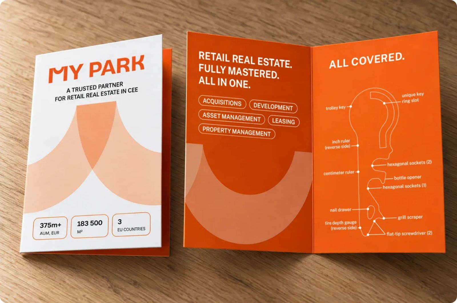
We carried the same idea through the rest of the identity with “smiling” typography, a cheerful palette and playful spatial elements. The result is a visual system that feels friendly at first glance, yet remains simple and flexible enough to work across dozens of applications and several European markets.
The result
MY Park gained a consistent and instantly recognisable identity that can unite its entire network of retail parks without losing its human touch. An ordinary M became both a smile and a shopping bag, a simple symbol for what MY Park ultimately wants to be: a place for happy shopping.
More projects
you might like