A clean identity doesn't have to feel sterile
A clean identity doesn't have to feel sterile
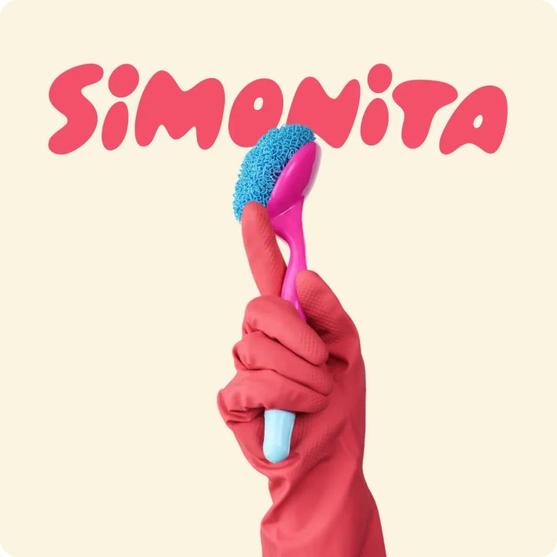
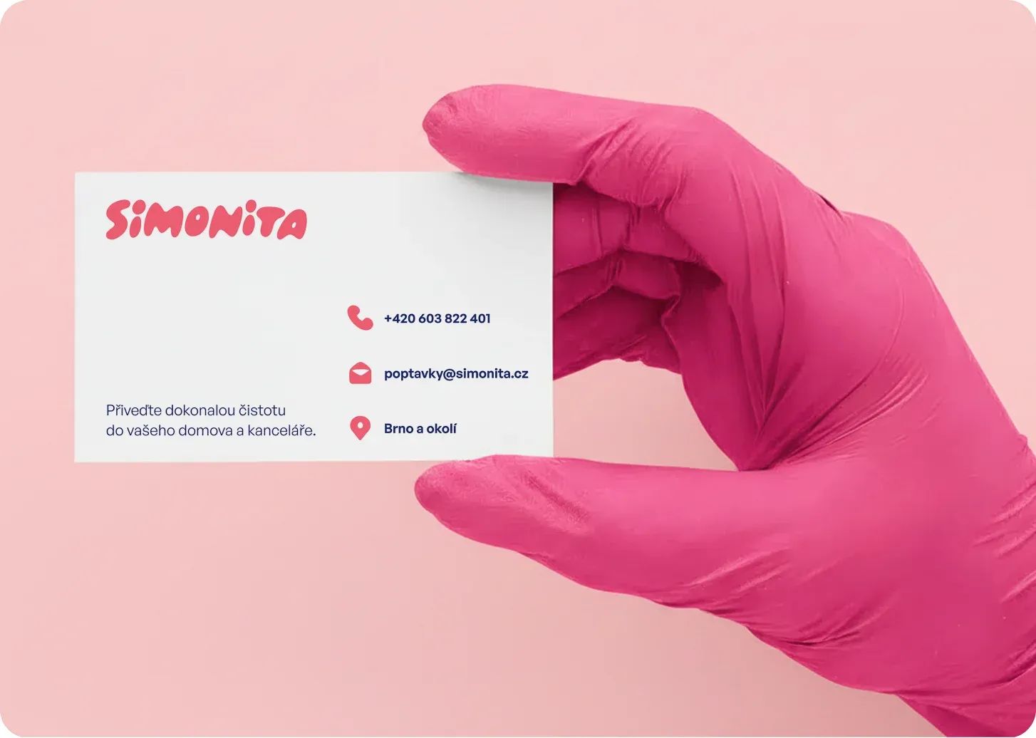
Cleaning brands tend to speak the same visual language: sparkling stars, spray bottles, sponges, brooms, blue or green colour palettes and photographs of impossibly spotless homes. For Simonita, we wanted to create an identity that clearly belonged to the world of cleaning services while reflecting the personality of its owner, Simona, who happens to love pink and isn't afraid to stand out.
The challenge
Simonita provides professional cleaning services and upholstery cleaning. Our task was to create a new visual identity that would feel modern and trustworthy, but also friendly, fresh and a little playful.
The solution
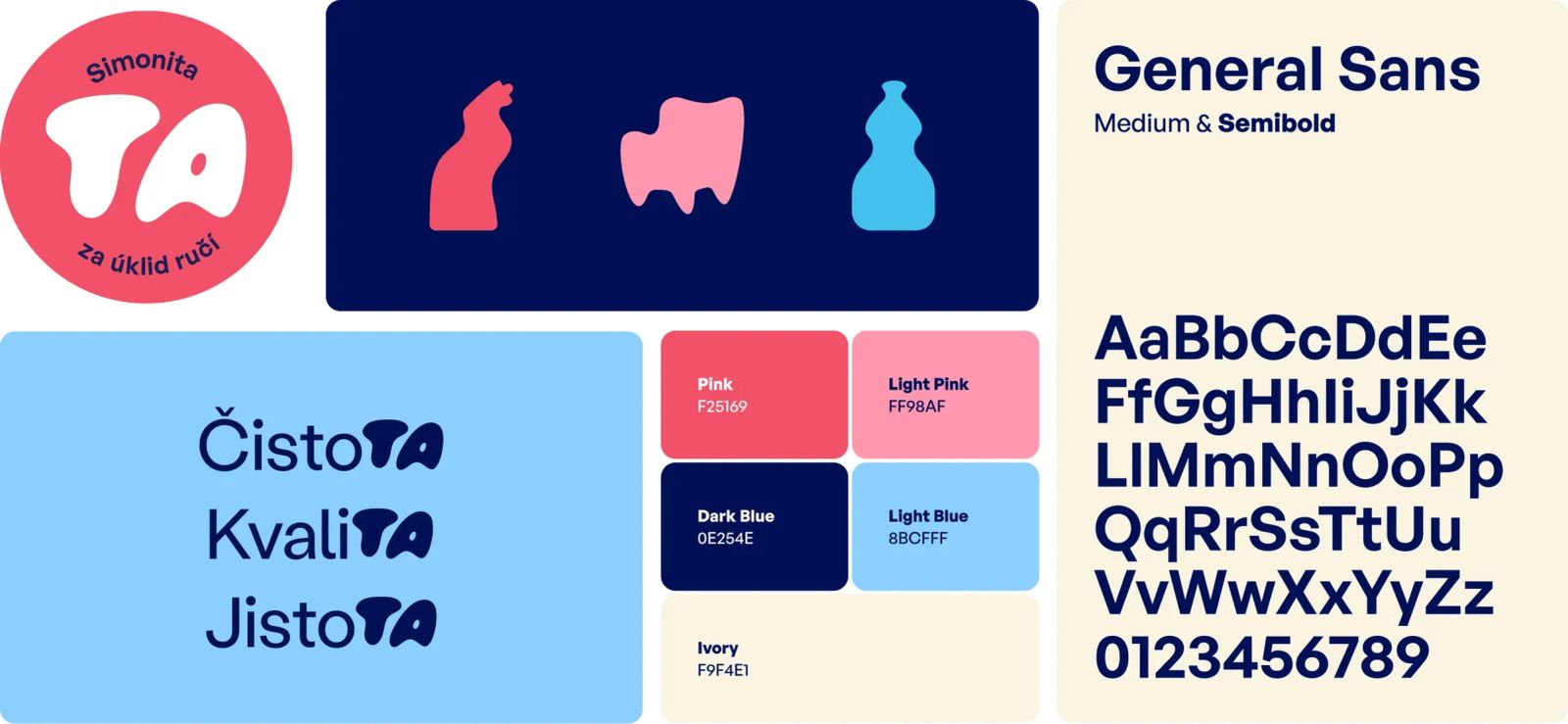
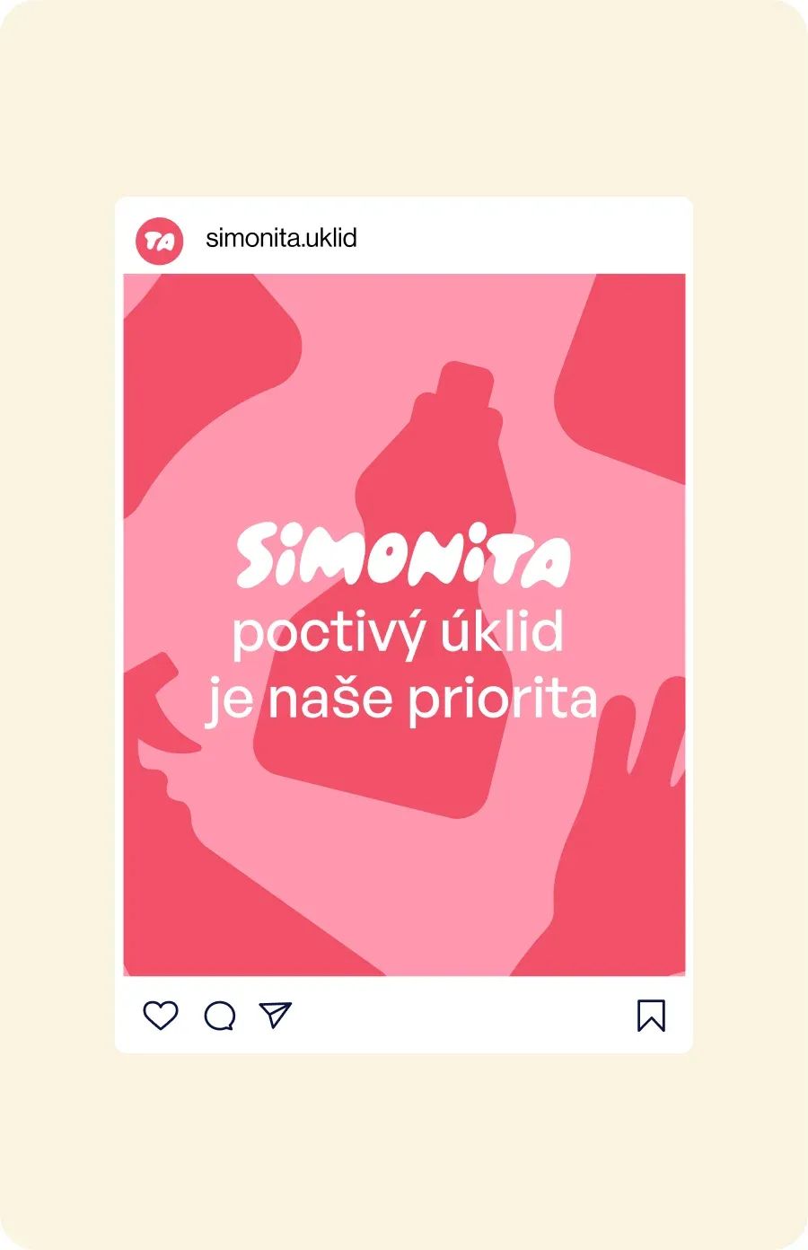
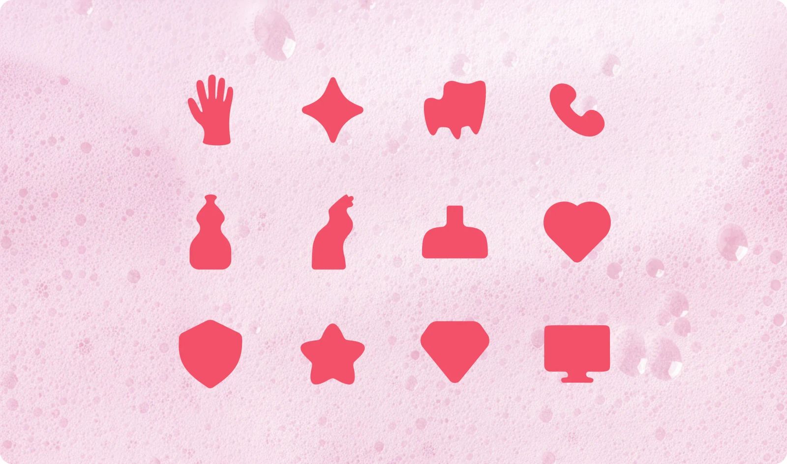
To stand apart in a category where many competitors look remarkably similar, we decided to keep the usual cleaning symbolism subtle. Instead, we took inspiration from the organic, fluid shapes of water and foam, the essentials of almost every cleaning job, and incorporated them into a custom wordmark, icons and graphic cut-outs.
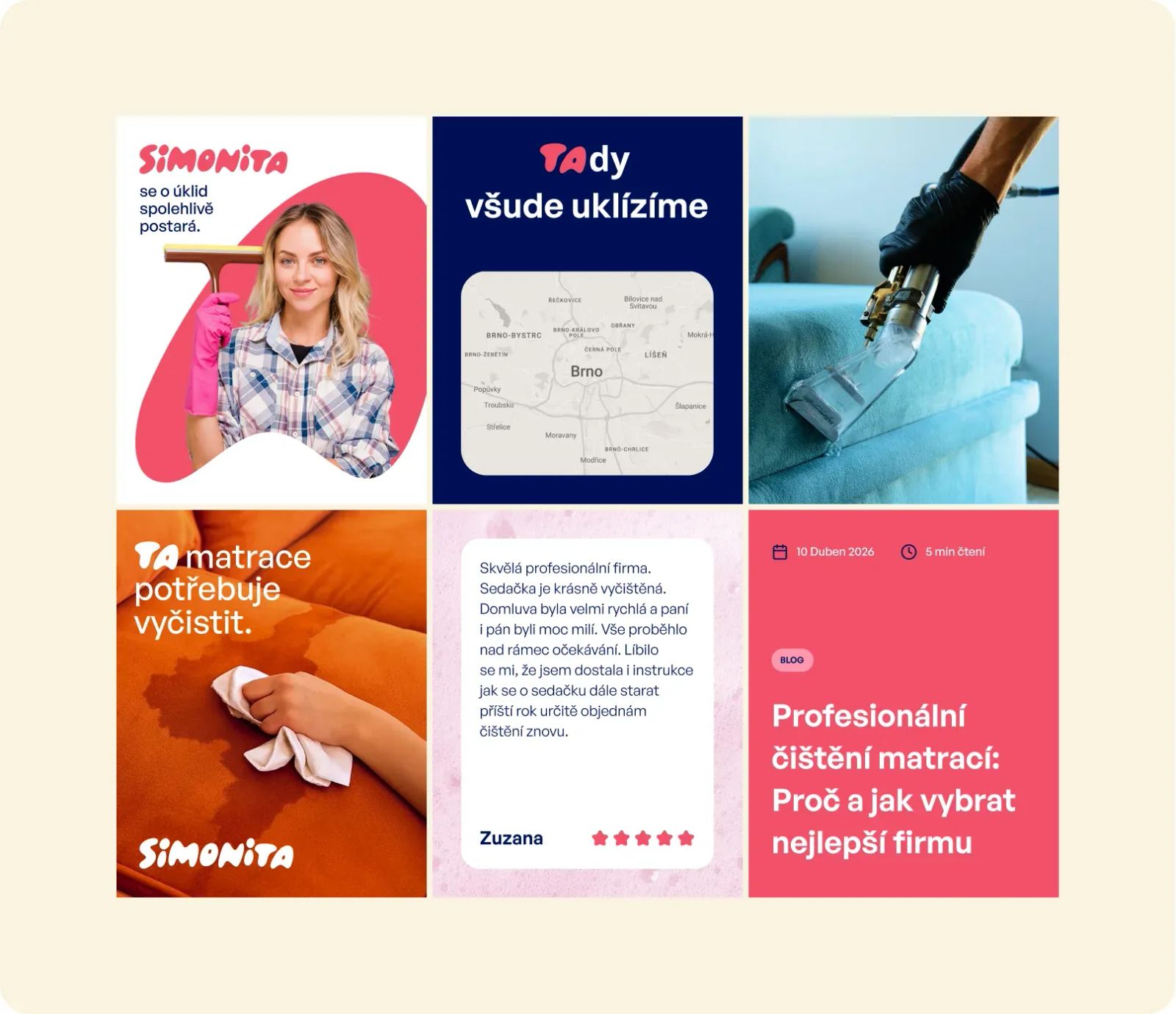
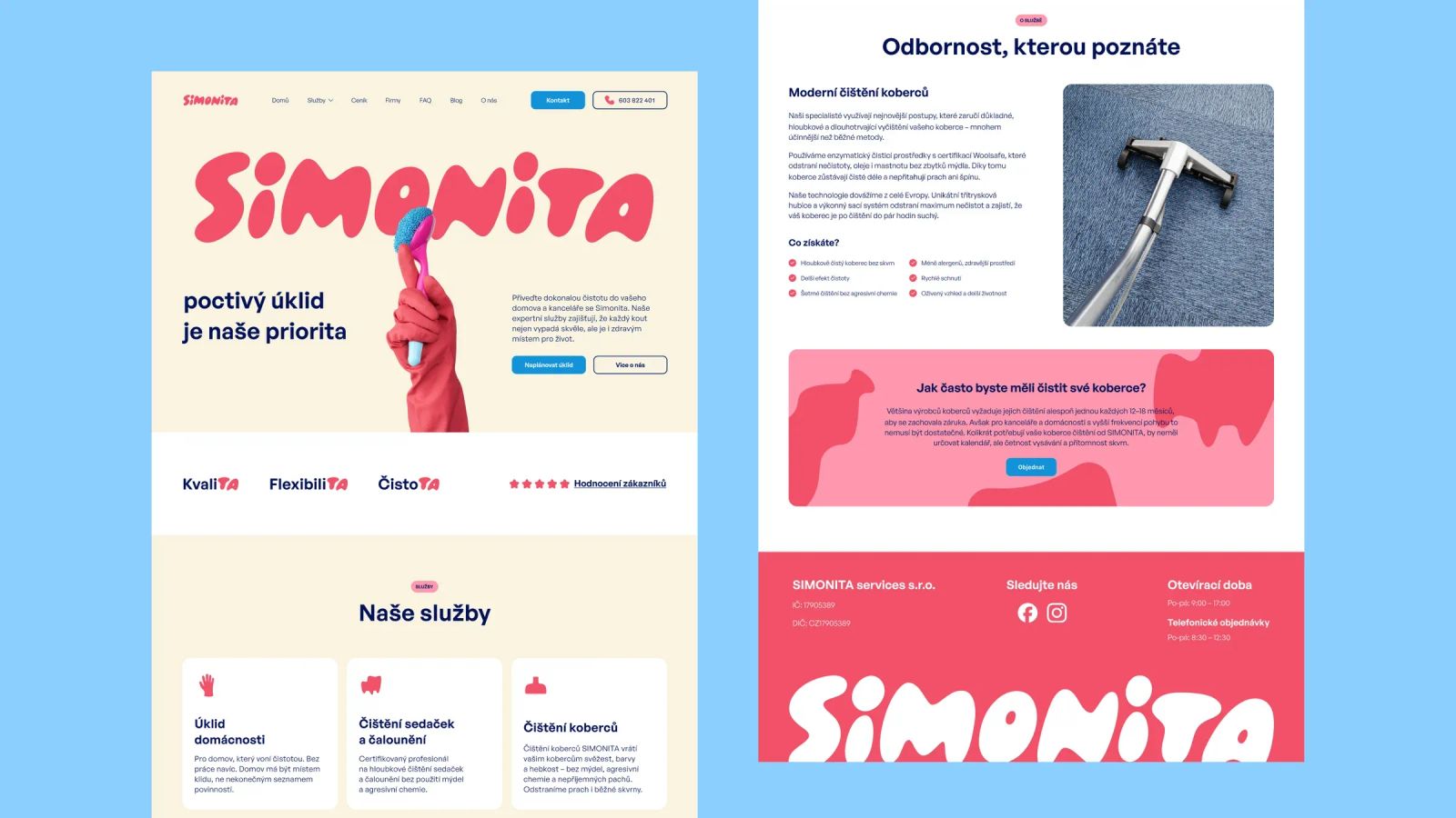
But we didn't stop at the logo. Hidden inside the name Simonita was another opportunity. We turned the ending “TA” into a distinctive typographic device that had a potential to become a distinctive part of both the visual identity and the brand's copy.
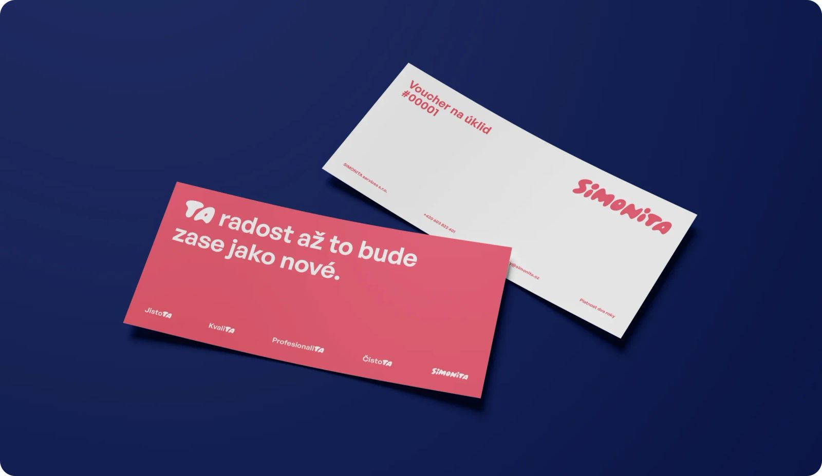
In Czech, this allows us to play with phrases such as TA sedačka potřebuje vyčistit (THAT sofa needs cleaning) or highlight the same letters within words such as čistoTA (cleanliness) and kvaliTA (quality). We even created a custom character set, Ta Bold, specifically for the system.
The result
The identity captures exactly how Simonita wants to come across: simple, modern, friendly yet professional. The identity is clean without being sterile.
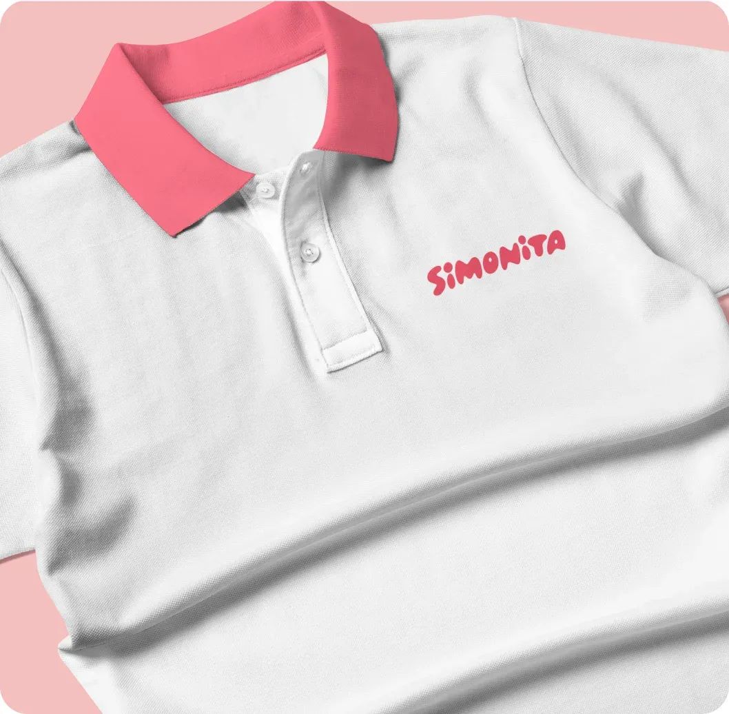
Simonita now has its own visual language that works very well across all media – website, leaflets, vouchers, uniforms and social media communication. And the playful TA gives the brand a memorable communication device that can keep evolving across virtually any format or medium.
More projects
you might like