An identity that set the airport’s transformation in motion
An identity that set the airport’s transformation in motion
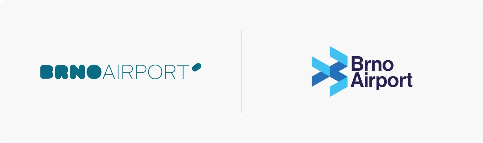
Brno Airport has undergone major modernisation in recent years. A new visual identity was one of the first visible steps in this transformation. The rebrand aimed to unify the airport’s communication and support its ambition to become a modern regional transport hub with a clear and consistent presence across both physical and digital environments.
The challenge
Brno Tuřany is an international airport handling passenger traffic as well as cargo, private, training and business aviation flights. Our task was to create a contemporary and confident visual system that would be clear, distinctive and easy to apply across both offline and online touchpoints.

The solution
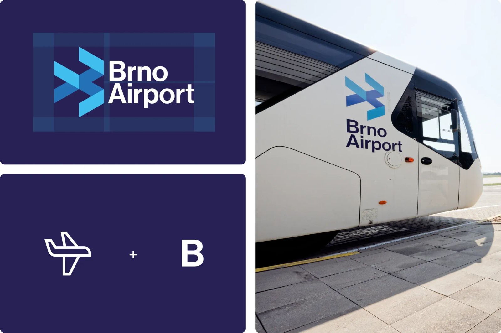
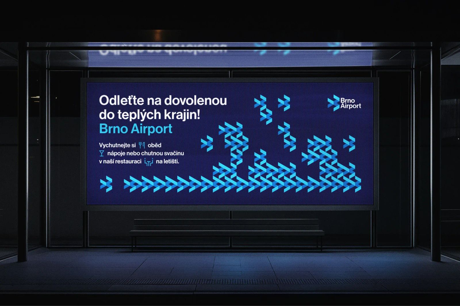
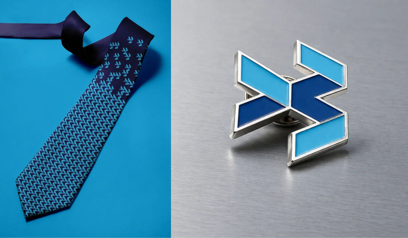
Movement, flight and connecting places became the core principles of the new identity. We built the brandmark from simple modular geometric shapes. Look closely and you can find the letter B for Brno, the silhouette of an aircraft in flight, as well as the idea of moving from one destination to another.
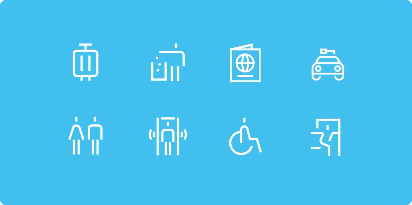
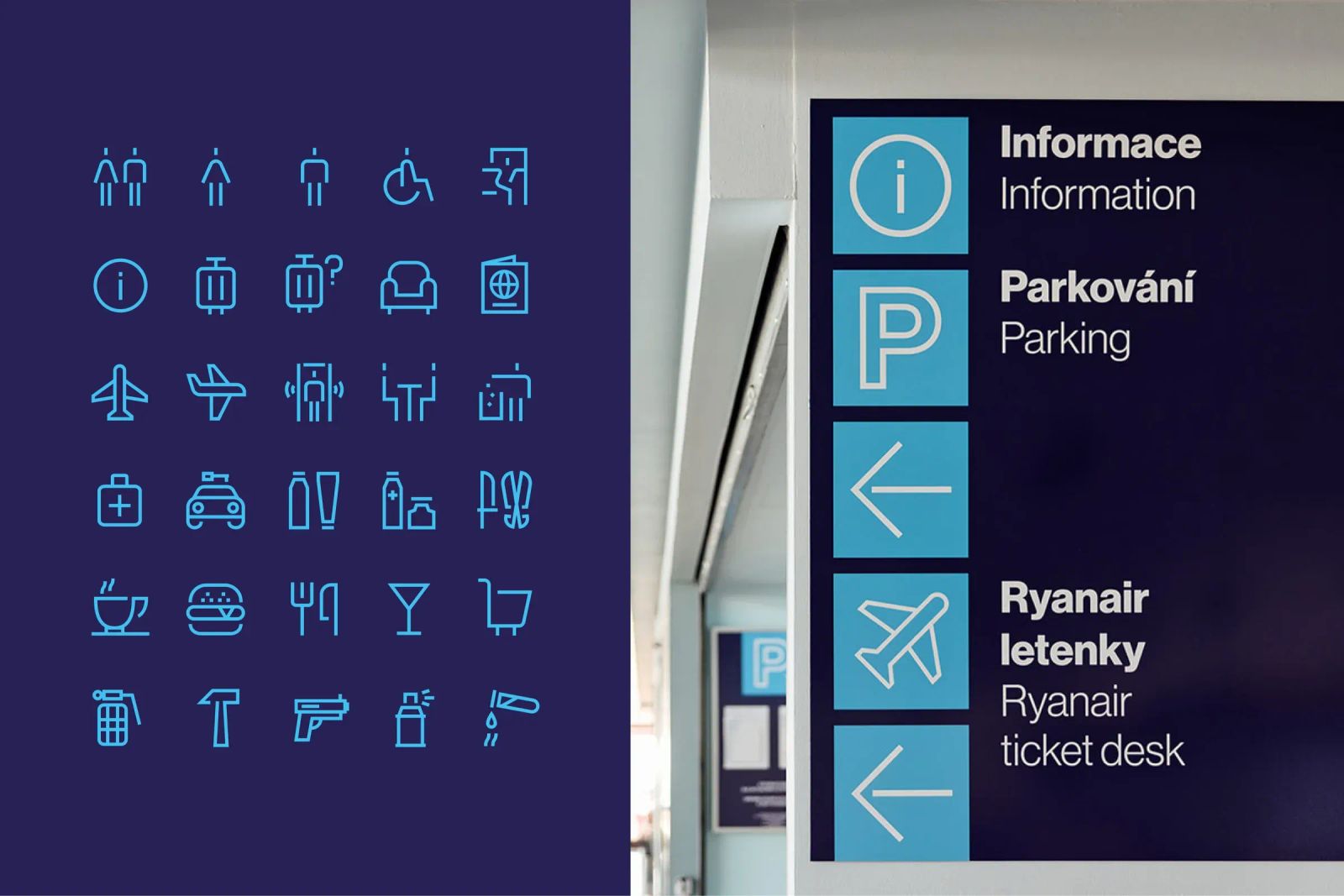
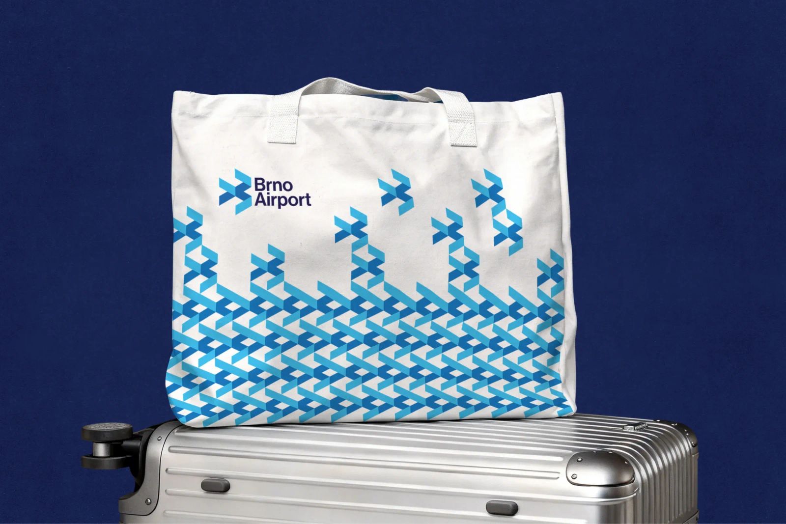
The same geometric segments became the building blocks of the entire identity. They can be combined, shifted, resized and rearranged to create an almost endless variety of compositions. This allows the system to work just as well in static graphics as it does in motion, on a small screen or across large-format applications.
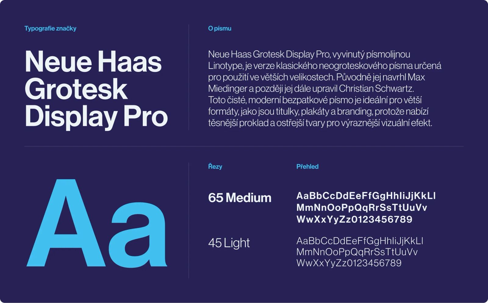
For the primary typeface, we chose Neue Haas Grotesk. Timeless and highly legible, it gives the identity a sense of clarity, professionalism and confidence. Its neutrality makes it equally effective in wayfinding, digital environments and brand communication.
The colour palette is built around three shades of blue. They naturally reference the sky and the world of aviation while also connecting the airport’s new identity with the colours of Accolade, its new owner.
The result
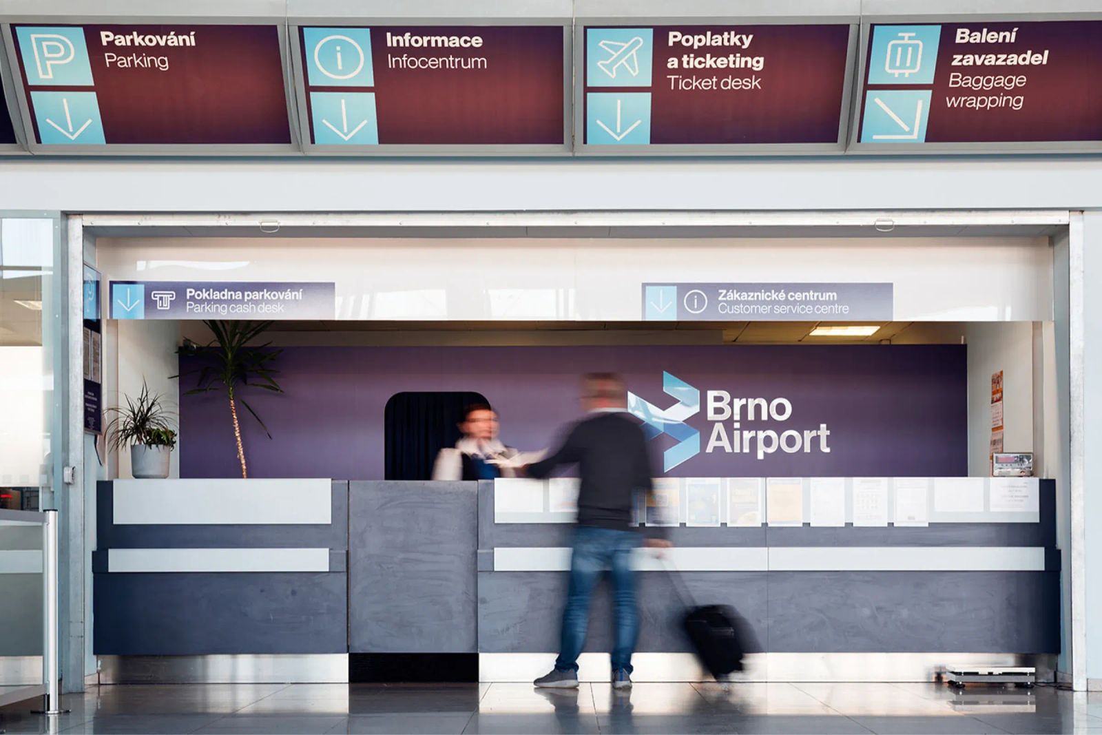
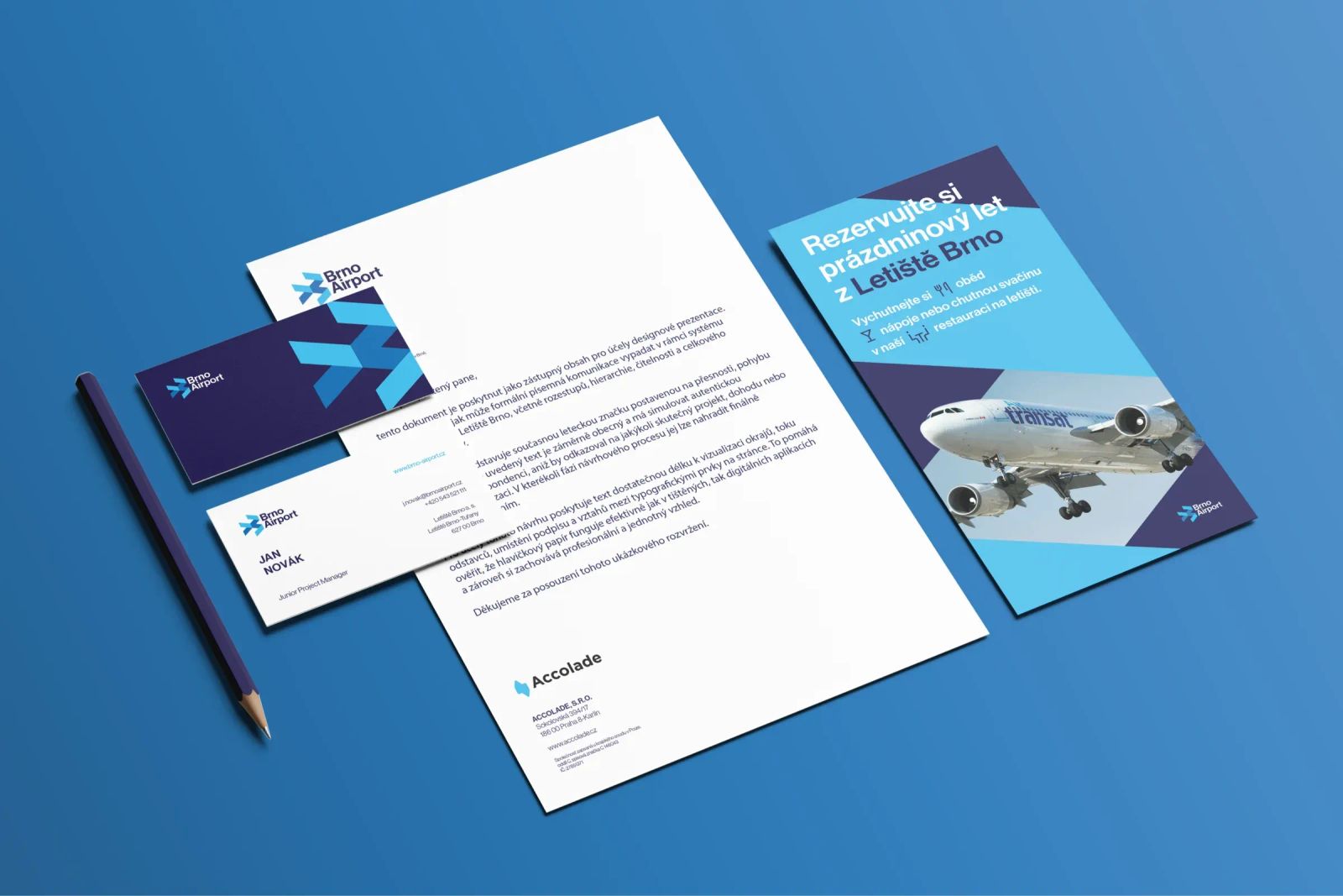
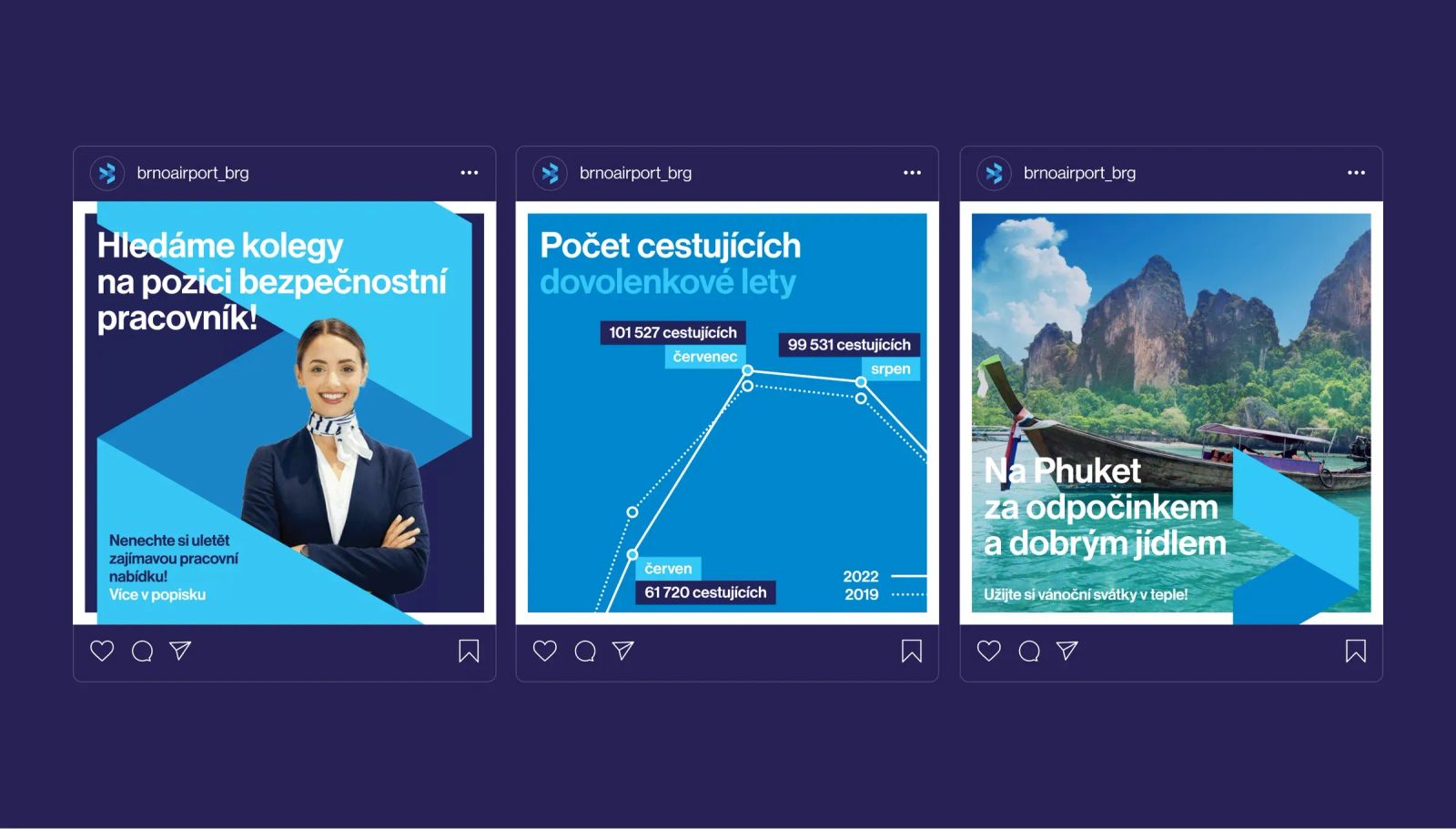
The result is a modern, highly adaptable visual identity that works across the airport itself as well as every major communication channel. Rather than creating a single static symbol, we built a flexible visual system around movement, transition and constant change – principles that come naturally to an airport.
More projects
you might like